Each target's page will show a visualization of the target's responses at the top of the page.
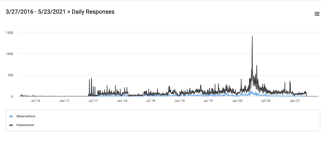
The key to the graph is at the bottom left. The bright blue line represents observations (poll responses). The black line represents impressions or the number of times the poll unit was loaded.
In the upper right corner of that visualization is a hamburger menu. Using it, you can choose to:
- View the visualization on your full screen
- Print the chart
- Download an image in PNG format
- Download an image in JPEG format
- Download a PDF of the visualization
- Download an image in SVG format
- Download the data table in CSV format
- View the data table